This year’s inaugural AGI W3G unconference – “The Three Ws of Geography” was a breath of fresh air on the Geo-related conference circuit, which I am afraid to say I have happily ignored for some years now. There are only so many vendor pitches and PR presentations a man can take before deciding it’d be time better spent to go into the office and do some work instead.
The unconference format promises to cut to the chase. People present, not organisations, and the format is more social, open and democratic. This of course makes the content difficult to predict, but I found that despite the apparent potential for a chaotic day of unrelated sessions, in fact W3G had some really strong themes running through it. Most of these touch on my “pet subjects”: pushpin overkill, poor usability, maps for the sake of it.
Why is this? Why do GIS applications come across so poorly? I have a theory here – it’s one of my pet subjects after all. Because GIS applications are usually sold to GIS people, they have one template in mind of what the UI should be: ArcVIew 3 effectively.
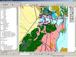
Fill the screen with icons on tool bars and GIS people will want to buy it. Make it more simple or appear to “do less” and you may well sell fewer. GIS teams may then want the same thing as a web application to show off their lovely 250 datasets. But the people who use the application will suffer: the “toolbox” approach doesn’t tell you where to start or what to do: it forces the average user to have to think too much, and on the web, attention spans are too short to guarantee any sort of success. If you’re used to using desktop GIS, or even the legacy web GIS applications, then you won’t spot this. GIS apps need to focus far more on focussed, simpler workflows, not lists of data and tools, if they are to be used successfully by large amounts of ordinary users. In essence, they should not bear any visual resemblance to a GIS app, I’d say.
For my money I’d offer the user a choice of settings wherever a design decision has been made that could affect the interpretation. If you use a heatmap at small scales, say something about how grid size affects the pattern, and even allow the user to change it. If you use point clusters, explain that you cannot tell what the distribution of the points is – allow the raw data to be switched on, colour coded to show which cluster they represent. But don’t avoid these techniques just because of potential ambiguity, the alternative is the full extent map with one million markers that says absolutely nothing.
Many of the points that were made – about geographic visualisation and analysis –were made by people who don’t come from the GIS tradition, but instead have expertise in usability, design, non-geographic visualisation: as a GIS professional I can benefit from extremely relevant experience from outside my field, that a traditional GIS conference cannot offer.
Compare this to the GeoCommunity sessions: what’s the difference, at first glance at least? Well, to me the major contrast was the focus on consumer applications of geotechnology, and the huge emphasis this inevitably places on usability (meaning many things, but including data quality, a tested application, simple rendering of complex data – making the user have to think less). The “traditional” GIS community is usually far more preoccupied with a business-to-business or academic focus, where standards and data interoperability and dry discussion of formats and functionality and features will necessarily dominate. The danger for me is that the the huge convergence of the two approaches, and the lessons each can teach to the other, are in danger of being ignored by “traditional” Geo community events. This could perhaps risk missing an enormous opportunity to reach a new consumer audience who now want to do a bit more with their location than spray it around Twitter in Foursquare spam-tweets, and may well want to take advantage of a bit of old-skool GIS analyis, if only it can be presented to them without them realising that that is what it is.
The unconference format promises to cut to the chase. People present, not organisations, and the format is more social, open and democratic. This of course makes the content difficult to predict, but I found that despite the apparent potential for a chaotic day of unrelated sessions, in fact W3G had some really strong themes running through it. Most of these touch on my “pet subjects”: pushpin overkill, poor usability, maps for the sake of it.
1. Your data is rubbish
This came up in Steven Feldman, Charles Kennelly and Peter Batty’s talks, albeit in subtly different ways:- Your data doesn’t always need to be mapped: think first: does it say anything useful?
- Your data is not sufficiently self-describing. Don’t waste time and money thinking you can manage metadata as a separate task – tell your users more about your data’s provenance IN the dataset.
- Publishing meaningless data - even in a pretty iPhone or iPad app - is a serious usability issue. Do more user testing first!
2. The Usability of your geo-app is poor
Consumer geo applications beat old-school GIS ones in terms of usability, because of the mantra to simplify, and then simplify again. Peter Batty quoted from Krug and make Jacob Nielsen’s 20-year-old point about usability testing: get anyone to do it, tell them nothing, and shut up and watch. 5 to 7 users will find 80% of your defects this way, as well as telling you way more about usability than you could ever guess as the designer or developer of an application.Why is this? Why do GIS applications come across so poorly? I have a theory here – it’s one of my pet subjects after all. Because GIS applications are usually sold to GIS people, they have one template in mind of what the UI should be: ArcVIew 3 effectively.
Fill the screen with icons on tool bars and GIS people will want to buy it. Make it more simple or appear to “do less” and you may well sell fewer. GIS teams may then want the same thing as a web application to show off their lovely 250 datasets. But the people who use the application will suffer: the “toolbox” approach doesn’t tell you where to start or what to do: it forces the average user to have to think too much, and on the web, attention spans are too short to guarantee any sort of success. If you’re used to using desktop GIS, or even the legacy web GIS applications, then you won’t spot this. GIS apps need to focus far more on focussed, simpler workflows, not lists of data and tools, if they are to be used successfully by large amounts of ordinary users. In essence, they should not bear any visual resemblance to a GIS app, I’d say.
3. Make the complex simple
I especially liked Richard Treves’ presentation, coming from a design and visualisation aspect, but touching on the age-old cartographic problem of how to present millions of points in a clear and readable way, without distorting the pattern or introducing bias.For my money I’d offer the user a choice of settings wherever a design decision has been made that could affect the interpretation. If you use a heatmap at small scales, say something about how grid size affects the pattern, and even allow the user to change it. If you use point clusters, explain that you cannot tell what the distribution of the points is – allow the raw data to be switched on, colour coded to show which cluster they represent. But don’t avoid these techniques just because of potential ambiguity, the alternative is the full extent map with one million markers that says absolutely nothing.
The Big Deal about W3G
So what made it such a different experience? I think for me, the fact that organisations such as Google, Nokia, and Yahoo were present and actively contributing put what can otherwise be a parochial, academic, insular sort of event into a much wider context. And made the point, repeatedly, that location is a feature – not the be all and end all of any application. Even a hardcode GIS one! Well, so say I.Many of the points that were made – about geographic visualisation and analysis –were made by people who don’t come from the GIS tradition, but instead have expertise in usability, design, non-geographic visualisation: as a GIS professional I can benefit from extremely relevant experience from outside my field, that a traditional GIS conference cannot offer.
Compare this to the GeoCommunity sessions: what’s the difference, at first glance at least? Well, to me the major contrast was the focus on consumer applications of geotechnology, and the huge emphasis this inevitably places on usability (meaning many things, but including data quality, a tested application, simple rendering of complex data – making the user have to think less). The “traditional” GIS community is usually far more preoccupied with a business-to-business or academic focus, where standards and data interoperability and dry discussion of formats and functionality and features will necessarily dominate. The danger for me is that the the huge convergence of the two approaches, and the lessons each can teach to the other, are in danger of being ignored by “traditional” Geo community events. This could perhaps risk missing an enormous opportunity to reach a new consumer audience who now want to do a bit more with their location than spray it around Twitter in Foursquare spam-tweets, and may well want to take advantage of a bit of old-skool GIS analyis, if only it can be presented to them without them realising that that is what it is.